New and improved!!!!
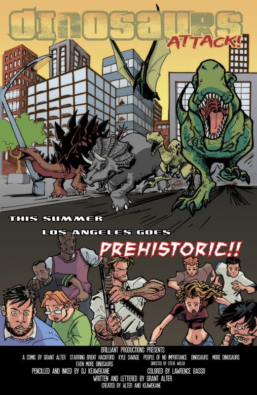
Until it gets printed, it's a work in progress. Here's the new and improved version.
Thanks to Lawrence for all the learnin'. For the record, the reason the other post looks so oversaturated is entirely my fault. I had the color setting wrong. This is the "director's cut" version with colors as Lawrence intended.
EDIT: And thanks to Charlie Clark for pointing me to the awesome movie poster font. Without it, it just don't look the same.
I am lucky to be surrounded by super talented folks.


0 Comments:
Post a Comment
<< Home